
What Makes a Mobile Friendly Website? Going Beyond Responsive.

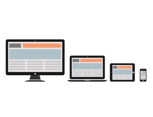
With the increased amount of smartphone and tablet use, having a mobile friendly website is crucial. In previous articles we have explained The importance of responsive Web design. Responsive Web design readjusts site content depending on what device someone is using. If you want to please all of your visitors and stay ahead of your competitors, a responsive website is a must. But making your website mobile friendly doesn’t stop there. So what else can you do to ensure your site is displayed beautifully on any device?
Page Load Times
We agree…your site should be gorgeous. But if you consider eye-catching content to be galleries of high-res graphics and streaming videos, you may be in trouble. It’s true that an attractive design plays a huge part in the conversion rate. However, download speeds should be the number one design criterion for site owners. It doesn’t matter how stunning your site is, if it takes longer than 3 seconds to load, visitors may abandon it.
This web design concept is nothing new, however internet connections on mobile devices can be significantly slower than traditional desktop connections, thereby making fast loading content that much more crucial.
Visible Calls to Action
Calls to action are any items that prompt your to visitors to take some type of action. This could be a phone number, a link to your Facebook or a place to sign-up for your newsletter. In order to ensure your visitors convert into a lead, or a customer, place these calls to actions are near the top of your site. This way users don’t have to scroll to see this information.
Search Results
We don’t have to tell you how important it is for your business to be listed in the search results. But what you may not have considered is that search is even more critical when it comes to mobile devices. Being on the third or fourth page of Google may not be enough. There are not too many smartphone users patient enough to flip through page after page of search engine results. If you want to drive smartphone traffic to your website, you should strive to be in Google’s top results.
Voice Search
Design isn’t the only thing changing to accommodate mobile users. The way people search is evolving also.
“The tipping point at which more searches take place on mobile devices than stationary computers is coming faster than many think,” said Google’s Search Engineer Matt Cutts.
Instead of typing in a few keywords on a keyboard, people are speaking their search terms into Siri and other voice activated apps. This results in a more “conversational search”. For example, instead of saying “Pizza Shelby Township”, people may say “Where can I find pizza in Shelby Township?”
Think Local
When optimizing your site for the internet search, be sure to include your location in your key phrase. This is always a good practice, but becomes even more necessary with mobile search, as most search results are prioritized by geographical locations.
What Makes a Mobile Friendly Website? Going Beyond Responsive.
Spyder Byte Media is a Michigan Web Design and Internet Marketing Company located in Shelby Township, Michigan. Spyder Byte Media has helped hundreds of small business owners in Michigan make it to the top of the search engines and create more revenue by converting their website traffic into new clients.


